The following blog entry is simply a series of color theory vocabulary definitions. These are not in my own words and have come from a variety of sources on the Internet that are referenced at the end of each term.
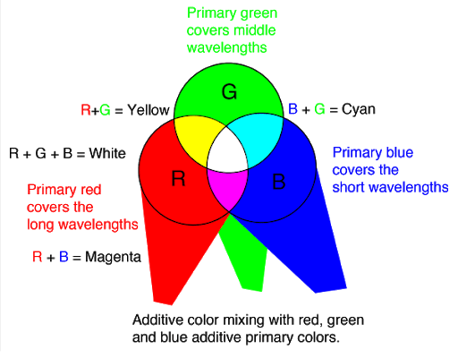
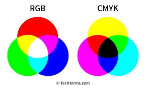
Additive Color: Defined as how colors are made by mixing the primary colors red, green, and blue, and how those mixed colors perceived by the human eye. source
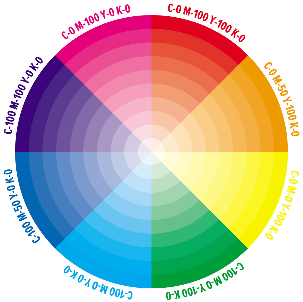
Analogous Color: Any one of a group of related colors that are near each other on the color wheel, a circular chart that shows gradations of color ie. yellow and red are analogous to orange. source

CMYK Color: Stands for “Cyan Magenta Yellow Black.” These are the four basic colors used for printing color images. Unlike RGB (red, green, blue), which is used for creating images on your computer screen, CMYK colors are “subtractive.” This means the colors get darker as you blend them together. source

Color Depth: The number of distinct colors that can be represented by a piece of hardware or software. Color depth is sometimes referred to as bit depth because it is directly related to the number of bits used for each pixel. source

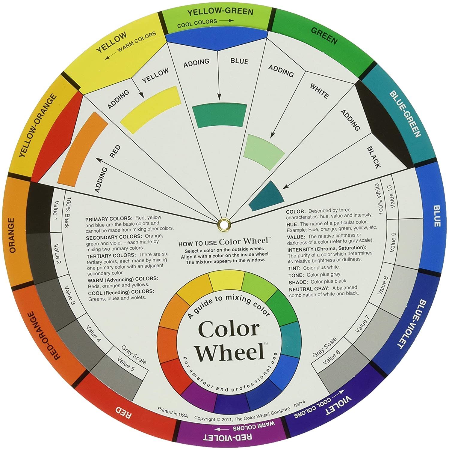
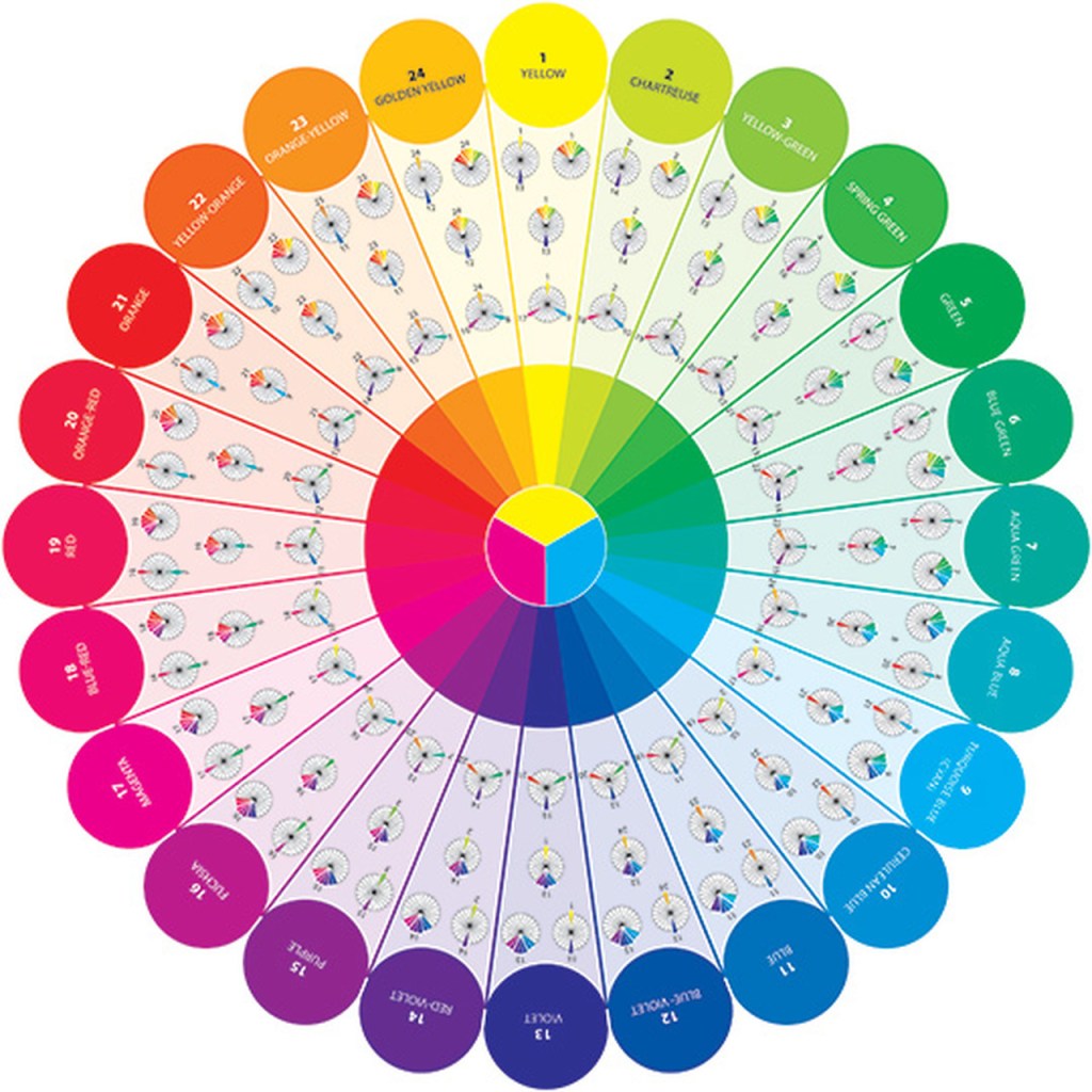
Color Wheel: a visual representation of colors arranged according to their chromatic relationship. source
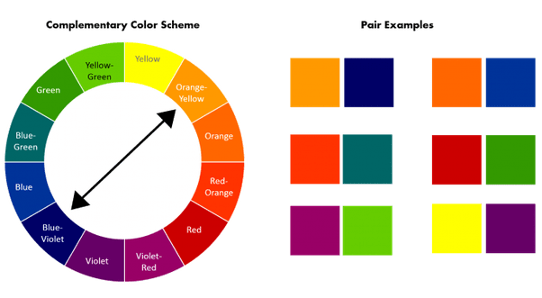
Complimentary Colors: Those colors located opposite each other on a color wheel such as green and red. source
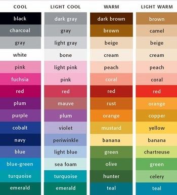
Cool Colors: any color that is calm or soothing in nature. Cool colors are not overpowering and tend to recede in space. For this reason, cool colors typically make a space seem larger. Examples of cool colors include green, blue and violet (think calming blue waters). Some also use cool colors to describe more neutral white and greys. source

Grayscale: a scale of achromatic colors having several, usually ten, equal gradations ranging from white to black. source

Hue: refers to the dominant Color Family of the specific color we’re looking at. White, Black and Grey are never referred to as a Hue.Hue refers to the origin of the color we see. Think of the Hue as one of the six Primary and Secondary colors. In other words, the underlying base color of the mixture you’re looking at is either Yellow, Orange, Red, Violet, Blue or Green. source

Monochromatic: A monochrome or monochromatic painting is one created using only one color or hue. (personally most of my favorite works are monochromatic I love this technique in color.) source

RGB Color: Stands for “Red Green Blue.” RGB refers to three hues of light that can be mixed together to create different colors. Combining red, green, and blue light is the standard method of producing color images on screens. source
Saturation: the brilliance and intensity of a color. source

Shade: Term for a color darkened with black. source

Subtractive Color: created by completely or partially absorbing (or subtracting) some light wavelengths and reflecting others. Subtractive colors begin as white. As you add filters to the white light, such as ink, this white light takes on the appearance of color. Photos, magazines, and any printed material use subtractive color. source

Tint: A Tint is sometimes also called a Pastel. But to be precise, Color Theory defines a True Tint as any Hue or mixture of pure colors with only White added. A Tint lightens the color, but it doesn’t make it brighter. Even though the color may appear brighter, in actual fact it is not. In other words, it remains exactly the same color, only a paler version. source
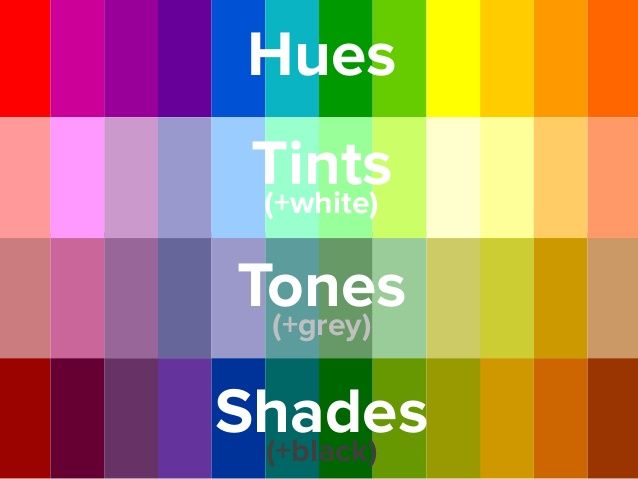
Tone: any Hue or mixture of pure colors with only Gray added. To be precise, this definition considers Gray as truly neutral. In other words, there are no additional pigments in the Gray other than White plus Black. A neutral mixture of Gray, no matter how light or dark, will tone down the intensity of any color source
Triadic: A triadic color scheme uses colors that are evenly spaced around the color wheel. Triadic color harmonies tend to be quite vibrant, even if you use pale or unsaturated versions of your hues. To use a triadic harmony successfully, the colors should be carefully balanced – let one color dominate and use the two others for accent. source

Warm Colors: any color that is vivid or bold in nature. Warm colors are those that tend to advance in space and can be overwhelming. Examples of warm colors include red, yellow and orange (think exciting fire and volcanoes). Contrast with cool colors. source