The following are a series of logotype definitions, none of these are in my own words nor are the images used mine. Everything provided in this post was retrieved from the internet and all definitions are referenced at the end of each term.
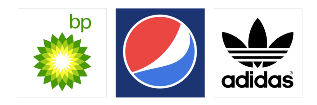
Abstract Mark: a specific type of pictorial logo. Instead of being a recognizable image—like an apple or a bird—it’s an abstract geometric form that represents your business. A few famous examples include the BP starburst-y logo, the Pepsi divided circle and the strip-y Adidas flower. Like all logo symbols, abstract marks work really well because they condense your brand into a single image. However, instead of being restricted to a picture of something recognizable, abstract logos allow you to create something truly unique to represent your brand. source
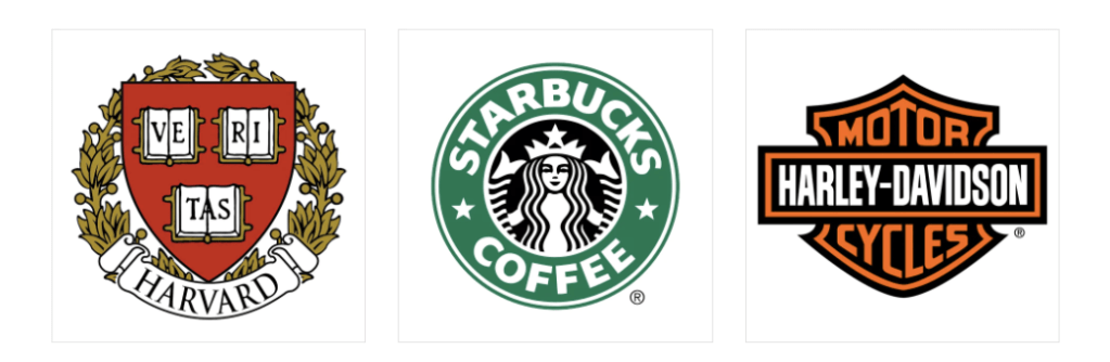
Emblem: consists of font inside a symbol or an icon; think badges, seals and crests. These logos tend to have a traditional appearance about them that can make a striking impact, thus they are often the go-to choice for many schools, organizations or government agencies. The auto industry is also very fond of emblem logos. While they have a classic style, some companies have effectively modernized the traditional emblem look with a logo designs fit for the 21st century (think of Starbucks’ iconic mermaid emblem, or Harley-Davidson’s famous crest). source
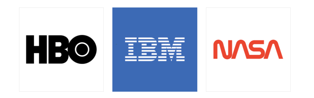
Lettermark: logos that consist of letters, usually brand initials. IBM, CNN, HP, HBO… Noticing a pattern, yes? They’re the initialisms of a few famous businesses with rather lengthy names. With 2 or 3 words to remember, they’ve each turned to using their initials for brand-identification purposes. So it makes perfect sense for them to use monograms—sometimes called lettermark logos—to represent their organizations. source
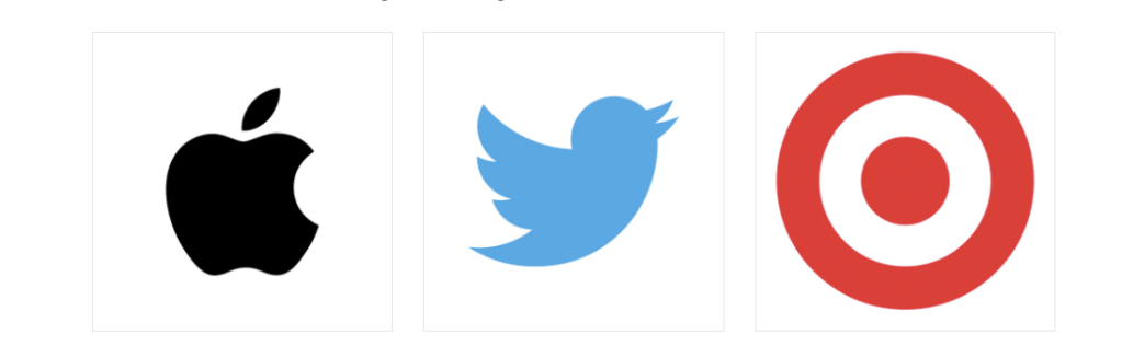
Pictorial Mark or Symbol: an icon—or graphic-based logo. It’s probably the image that comes to mind when you think “logo”: the iconic Apple logo, the Twitter bird, the Target bullseye. Each of these companies’ logos is so emblematic, and each brand so established, that the mark alone is instantly recognizable. A true brand mark is only an image. Because of this, it can be a tricky logo type for new companies, or those without strong brand recognition, to use. source
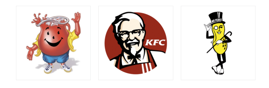
Mascot: logos that involve an illustrated character. Often colorful, sometimes cartoonish, and most always fun, the mascot logo is a great way to create your very own brand spokesperson. source
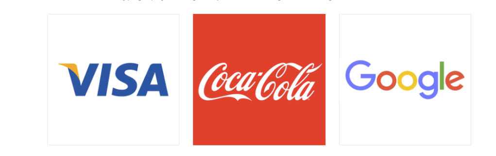
Wordmark: a font-based logo that focuses on a business’ name alone. Think Visa and Coca-Cola. Wordmark logos work really well when a company has a succinct and distinct name. Google’s logo is a great example of this. The name itself is catchy and memorable so, when combined with strong typography, the logo helps create strong brand recognition. source