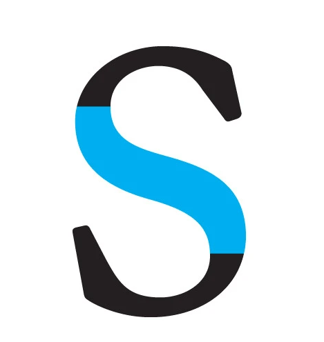
spine 
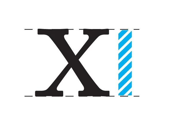
x height 
terminal 
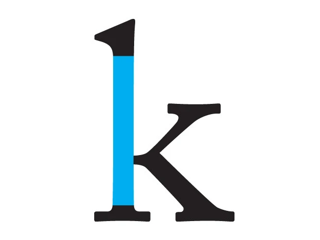
Stem 
Serif
Apex: The point at the top of a character such as the uppercase A where the left and right strokes meet is the apex. The apex may be a sharp point, blunt, or rounded and is an identifying feature for some typefaces.
Arm: The arm of a letter is the horizontal stroke on some characters that does not connect to a stroke or stem at one or both ends. The top of the capital T and the horizontal strokes of the F and E are examples of arms. Additionally, the diagonal upward stroke on a K is its arm. Sometimes arm is used interchangeably with bar or crossbar or cross stroke.
Ascender: The upward vertical stem on some lowercase letters, such as h and b, that extends above the x-height is the ascender. The height of the ascenders is an identifying characteristic of many typefaces.
Baseline:the baseline is the imaginary line upon which a line of text rests. In most typefaces, the descenders on characters such as g or p extend down below the baseline while curved letters such as c or o extend ever-so-slightly below the baseline. The baseline is the point from which other elements of type are measured including x-height and leading. The baseline is also significant in the alignment of drop caps and other page elements.
Bowl: the curved part of the character that encloses the circular or curved parts (counter) of some letters such as d, b, o, D, and B is the bowl. Some sources call any parts of a letter enclosing a space a bowl, including both parts of a double-storey g and the straight stem on a D or B. The curved strokes of a C are sometimes also referred to as bowls although they aren’t closed.
Cap Height: refers to the height of a capital letter above the baseline for a particular typeface. It specifically refers to the height of capital letters that are flat—such as H or I—as opposed to round letters such as O, or pointed letters like A, both of which may display overshoot. The height of the small letters is referred to as x-height.
Counter:the enclosed or partially enclosed circular or curved negative space (white space) of some letters such as d, o, and s is the counter. The term counter may sometimes be used to refer only to closed space, while partially enclosed spaces in m, n, or h are the aperture. The shape and size of the counter and bowl (curved stroke enclosing the counter) can affect readability and is also an identifying factor for some typefaces.
Crossbar: The (usually) horizontal stroke across the middle of uppercase A and H is a crossbar. The horizontal or sloping stroke enclosing the bottom of the eye of an e is also a crossbar. Although often used interchangeably, the crossbar differs from an arm and a cross stroke because each end connects to a stem or stroke and doesn’t (usually) intersect/cross over the stem or stroke. The varying positioning, thickness, and slope of the bar is an identifying feature of many type designs.
Descender:The portion of some lowercase letters, such as g and y, that extends or descends below the baseline. The length and shape of the descender can affect readability of lines of type and is an identifying factor for some typefaces.
Ear: Typically found on the lower case g, an ear is a decorative flourish usually on the upper right side of the bowl. Similar to a serif, the ear can be a distinctive, identifying element of some typefaces.
Finial:usually a somewhat tapered curved end on letters such as the bottom of C or e or the top of a double-storey a.
Ligature: Two or more letters combined into one character. some ligatures represent specific sounds or words such as the AE or æ diphthong ligature. Other ligatures are primarily to make type more attractive on the page such as the fl and fi ligatures. In most cases, a ligature is only available in extended characters sets or special expert sets of fonts.
Serif:the little extra stroke found at the end of main vertical and horizontal strokes of some letterforms. Serifs fall into various groups and can be generally described as hairline (hair), square (slab), or wedge and are either bracketed or unbracketed.
Spine:the main left to right curving stroke in S and s. The spine may be almost vertical or mostly horizontal, depending on the typeface.
Stem: the main, usually vertical stroke of a letterform.
Terminal: a type of curve at the end of a stroke that does not include a serif.
x-height:the distance between the baseline of a line of type and tops of the main body of lower case letters (i.e. excluding ascenders or descenders). The x-height is a factor in typeface identification and readability. Typefaces with very large x-height relative to the total height of the font have shorter ascenders and descenders and thus less white space between lines of type. Sans Serif typefaces typically have large x-heights. In typefaces with small x-heights, other letter parts such as ascenders and descenders may become more visually noticeable.
Definitions found on https://typedecon.com/ ❤